This is my third draft of my double page spread, from the second draft I outlined the pug in the top corner so it stood out more, and removed the background from the 'Hayley Pyatt' text as I thought it look too much. I also noticed an error in 'What not to do in 2010...' should have been 'What not to do in 2011...' so I changed this. However I still don't think my double page spread looks professional and to a high quality, I will next evaluate it and then make more possible changes to improve on it.
Tuesday, 28 December 2010
Wednesday, 22 December 2010
Double Page Spread Draft 2
This is my second draft of my double page spread, from the first draft I've added more text to the page, made the background gradient and also added a pug in the corner, I did this so that it would look like more of a conventional magazine page, however I still don't think the double page looks professional, I will get feedback and change and edit more elements of my double page spread in order to create a third draft.
Double Page Spread Draft 1
This is the first draft of my double page spread. This is a very basic double page, I will improve on this by adding more to the page as at the moment it looks very plain and unprofessional.
Thursday, 16 December 2010
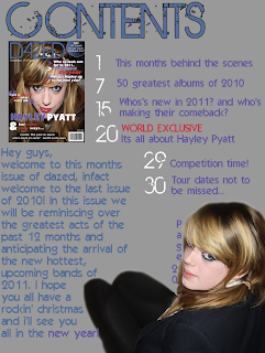
Contents Page Draft 3
This is my third draft of my contents page, from the second draft I changed my 'welcome' message so it was all in line with the image of the cover, so it follows conventions. I also added a dark grey background to this section so it frames it more, and sections it from the main contents. It also follows the layout I chose in my reasearch. Further improvement to this may include adding more pages and framing it around the model as currently 35 pages may not be enough for a magazine.
Tuesday, 14 December 2010
Contents page Draft 2
This is my second draft for my contents page. From the first draft I changed the shape of the writing and shaped it around the models legs so it doesn't cover so much of the image. I also blurred the edges of the image as they looked to sharp on the first copy. I have continued the house style in the sense of font and colour schemes. I will now get feedback to create the final draft of my contents page.
Thursday, 9 December 2010
Contents page Draft 1
This is the first draft of my contents page, I will get feedback and improve on it to make further drafts.
Contents page
Today I have begun to draft my contents page, this will have continuity from the cover, for example have the same colour scheme, images style etc. I will do a number a drafts before creating my final copy.
Wednesday, 8 December 2010
Front Cover Mock up 5
This is my fifth and possibly final draft of my front cover. The feedback that I got was that they liked how the pink text is the same colour as her lips so I kept this the same, however they said to add a pug and move the quote so it doesn't cover as much of the models face. This will be the bases of my final draft, all other changes that will be made should only be minor changes.
Friday, 3 December 2010
Front Cover Mock up 4
The feedback that I got from my third mock up was that it was that they preferred the quote and the 'whats inside section' where they were previously, as draft 3 looked far too unprofessional and not as eye catching, so i reverted back to how it was in that sense. I changed the font of the quote and the splash so that they would catch the readers eye and that they wouldn't be so plain to look at.
Price
After doing my first draft I realised there was no price on the front cover, so I researched the prices of other magazines in my genre/with the same target market. The prices ranged from £3.00 to £5.00, also many glossy magazine are priced around £3.90-£3.99. I will price my magazine at £3.90 as this is affordable and set at a competitive price, so its not overly expensive or cheap compared to other magazines in the market.
Front Cover Mock up 3
This is the third draft of my front cover, I removed the feature in the top left so that I could include the quote so that it wasn't on the face in the image. I also changed the fonts so that they are more able to read. I will get feedback on this cover so that I will know whether my audience like it cover more plain or not.
Thursday, 2 December 2010
Wednesday, 1 December 2010
Subscribe to:
Comments (Atom)


